EXERCISE EMPHASIS/BALANCE/REPETITION/MOVEMENT
Week 1 (24/08/2021) - Week 4 (14/09/2021)
Faith Aimee Choong Jia Yi / 0345509
Design Principles [GCD60804]
Exercise 02: Emphasis | Balance | Repetition | Movement

LECTURE [31/08]
Ms Jinchi gave us recorded lectures and created slides to help us learn about Emphasis, Balance, Repetition and Movement.
BALANCE:
- Distribution of visual weight in an artwork or design piece.
- It is the visual symmetry of the elements that cause the image to become balanced.
- Balance can either be symmetrical or asymmetrical.
Symmetrical Balance
Elements are arranged equally and each side has an equal weight.
Radial Balance
Elements are placed around a central point equally.
Asymmetrical Balance
Unequal weight of visuals on each side of the composition. There may be a dominant element on one side of the composition, which could be even out by fewer or more focal points on the other side. It offers more visual variety however it can be difficult to achieve this because the relationship between elements is more complex.
 |
Figure 1.0 https://wpamelia.com/wp-content/uploads/2019/04/balance.jpg |
 |
Figure 1.1 https://i.pinimg.com/originals/cf/68/7e/cf687effec440db95c132c395832684e.jpg |
The Golden Ratio
Also known as phi, it is a mathematical concept that can be found everywhere naturally. Over the years, many perceived the Golden Ratio as the representation of perfection or beauty. It is a guide to create visual balance in architecture or in paintings. The Golden Ratio can be used to bring harmony, balance, and structure to one's work and it increases the appearance of an artwork.
/GettyImages-651240376-645f9422a1684adbaea17576261113e5.jpg) |
Figure 1.2 https://www.thoughtco.com/thmb/GDoQL_2NzbiNl8P51x14nHSNBO0=/1929x1447/smart/filters:no_upscale()/GettyImages-651240376-645f9422a1684adbaea17576261113e5.jpg |
Rule of Thirds
It is a composition guideline that creates dynamism in an image. An image is divided into three horizontal and vertical lines. At the intersection of those divided lines, the focal image is placed there.
 |
Figure 1.3 https://capturelandscapes.com/wp-content/uploads/2017/10/Greenland-Husky-Rule-of-Thirds.jpg |
EMPHASIS:
- Used to create dominance and focus to a design.
- Various elements are used to create emphasis.
 |
Figure 1.4 https://i1.wp.com/theschedio.com/wp-content/uploads/2020/04/emphasis.jpg?resize=740%2C1123&ssl=1 |
REPETITION:
- Can make a design seem active.
- Creates rhythm and pattern in an artwork.
- Variety is crucial to keep the rhythm going and to avoid monotony.
- Patterns increase visual appearance and bring in a surface of interest.
Variety
A change or a difference in elements in a composition. Using the same element in a composition can be boring to one's sight, which is why variety is used to create an interesting work of art.
 |
Figure 1.5 https://bs-uploads.toptal.io/blackfish-uploads/uploaded_file/file/53679/image-1569220022690-7de987efea3f8b69298c0ad95d63b045.jpg |
- Elements placed in a rhythmic motion in a competition can attract one's attention to the flow.
- Movement in a visual image occurs when objects seem to be moving. This movement comes from the kinds of shapes, forms, lines and curves used in the composition.
Hierarchy
It is the order of content in a composition. It is used to communicate and highlight important information and convey meaning. Visual hierarchy attracts viewers to the most important message first then navigates them through the rest of the content.
Alignment
The placement of elements in a lineup formation is either in rows or columns and it creates a flow so that the viewer can follow through a design. It creates a sense of unity and cohesion which contributes to the style and stability of the design.
 |
Figure 1.6 https://i1.wp.com/befonts.com/wp-content/uploads/2021/06/Typograph-Pro-Font-2.jpg?fit=720%2C360&ssl=1 |
INSTRUCTIONS
Choose two principles from [Emphasis/Balance/Repetition/Movement] and produce a design for each one.
The two principles I chose are Emphasis and Movement. I chose Emphasis because it is one of my favourite principles. I like the way how elements or objects are placed as the central focus as it gets all the attention from the audience. I chose Movement because I wanted to try out this principle as I've never really included the principle of movement in my design.
VISUAL RESEARCH- EMPHASIS
Before starting my piece, I searched different kinds of artworks for ideas and inspiration.
 |
Figure 1.7 https://i.pinimg.com/564x/90/8d/16/908d161f7d57ed144ff11ba0e076f1d0.jpg |
 |
Figure 1.8 https://i.pinimg.com/564x/d4/3a/af/d43aaf0e5cd1b7084302dbb4d0a058ac.jpg |
IDEA EXPLORATION- EMPHASIS
Recently, I watched a Korean variety show called 'Loud', where talented young boys display their singing and dancing abilities in order to be hired as a trainee in one of Korea's famous singing companies, JYP Entertainment and P-Nation. There was a quote that grabbed my attention, 'The Quietest Person has the Loudest Mind'. The reason why this quote attracted me was because it relates to me as I was once a shy person and I was pretty imaginative as well.
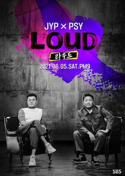 |
Figure 1.9 https://upload.wikimedia.org/wikipedia/en/thumb/b/b5/SBS_Loud_Poster.jpg/250px-SBS_Loud_Poster.jpg |
I decided to make an Emphasis composition piece following that quote by using visuals to represent it. I made some rough sketches to plan my Emphasis composition. These designs show how a designer thinks creatively when starting an artwork. I decided to go forth with the second ideation, I sketched. The second ideation is head to shoulder human figure which has a tiny person in the center indicating the self-conscious or the brain. There is a hollow pathway leading towards the tiny person and a finger pointing at the tiny person (focal point).
 |
| Figure 2.0 |
While making my Emphasis piece, I got the idea of adding objects to symbolize the creative brainstorming of ideas. Following my first visual research, I wanted to create that repetitive effect by using ripples. The ripples will be emitted from the center person which represents our brain but in a person-like form.
 |
Figure 2.1 https://i2.wp.com/bmgator.org/wp-content/uploads/2017/10/bigstock-Alice-is-falling-down-into-the-152096705.jpg?fit=900%2C776&ssl=1 |
When Alice fell into the rabbit hole, the tunnel has that ripple effect with all the objects flying in the air as Alice fell. [Alice in the Wonderland] I find this a great inspiration for my Emphasis piece when adding the objects into the design.
 |
| Figure 2.2 |
I wanted to be implicit with the word 'creative' by using visuals. In Figure 2.2, I've illustrated planets which shows thinking outside of the box, gears to show thinking, the palette and paintbrush which symbolizes the design planning, the book with the flying pages as brainstorming ideas, the paper rocket plane as the influence of other ideas and lastly the lightbulb which is the 'Aha' moment when a design is well-planned and thought out. The reason for choosing purple for the ripples is because of its dreamy feel as if you're walking through memory lane. I wanted a non-vibrant color for the ripples because I wanted the collage objects and the center focus to be the visual emphasis of this composition.
 |
| Figure 2.3 |
In Figure 2.3, I combined the objects into a collage. The objects are emitted from the center focus which is the tiny white person in the center. The tiny white person represents the brain while the objects are the brainstorming ideas of a creative designer.
FEEDBACK
By: Ms Jinchi
"Figure 2.3, she couldn't really see the focal point as there are many objects crowding around the focal point (tiny white person). She suggests making the objects into grayscale so that the focal point is more enhanced and also making the tiny person bigger in size."
 |
| Figure 2.4 |
Following Ms Jinchi's feedback, I converted the objects into grayscale. After doing this, I could almost see the emphasis put onto the tiny white person.
 |
| Figure 2.5 |
In Figure 2.4, the tiny person looked as if it was blending into the grayscale as it was just plain white so I decided to upgrade my Emphasis composition further by adding color to the tiny white person in the center as well as make it bigger and adjusting it to the center of where the finger is pointing at.
VISUAL RESEARCH- MOVEMENT
As for my Movement composition, I searched for some ideas and inspiration on Pinterest until I came across this wave-like motion which captured my attention. It looks like the ink-printing on paper. I decided to use this wave-like motion as my inspired technique for my Movement composition.
 |
Figure 2.6 https://i.pinimg.com/564x/82/33/db/8233db0ac82d40cefd922ba1372ea389.jpg |
 |
Figure 2.7 https://i.pinimg.com/564x/71/73/cf/7173cf160b650878ba2d2376b1c84a00.jpg |
IDEA EXPLORATION- MOVEMENT
As for my Movement composition, I thought of this idea while I was eating a homemade burger. When we are eating, our body digests the food we eat. The air that surrounds us moves continuously as we inhale and exhale. I decided to make a Movement composition showing the invisible motion that surrounds us.
 |
Figure 2.8 |
In Figure 2.8, I illustrated many lines playing with the thickness. The reason for having created these lines is because I want to incorporate the wave-like technique into this composition of mine. I will be using Adobe Photoshop to alter the lines into a curvy and wavy shape. The lines in the body are a mixture of colors from the burger showing the process of digestion while the lines in the air are a mixture of blue tones showing the airy motion.
 |
| Figure 2.9 |
After creating these wave-like motion lines, I realize the burger was blending into the colored lines of the body so I decided to convert it to black and white. That way the motion wave-like lines stand out more than the burger vector.
FEEDBACK
By: Ms Jinchi
"Figure 2.9, was that there is a lot of movement happening. She suggested sticking to one direction for the wave-like motion in the body while leaving the background plain white. Another suggestion she gave was making the lines longer and fading as it grows longer like speed lines."
Figure 3.0 https://images.all-free-download.com/images/graphiclarge/speed_background_powerful_running_man_icon_red_design_6830866.jpg |
Since burgers are categorized as fast food, Ms Jinchi's feedback was to imply the definition of fast into the artwork. In Figure 3.1, I utilized the speed lines or running lines into this figure eating a burger. I played with the variation of thick and thin, short and long lines to make the shape and form of the figure. I remove the blue background so that the movement can be visible to the viewer.
 |
| Figure 3.1 |
In Ms Jinchi's feedback for Figure 2.9, which is to stick with one direction of where the wave-like lines are going. Using Photoshop I pulled down the lines so that it's pointing downwards and also showing how the food is being digested down our body. I also removed the blue background so that the movement in this piece is visible to the viewer and it's focusing on one particular movement.
 |
| Figure 3.2 |
After drafting these two Movement compositions, I have to choose one for my final submission. I choose Figure 3.2 because I find that it has the most movement in my eye and I really love the wave-like techniques used in this design. As for Figure 3.1, it's striking and it also reminds me of the Olympics due to the speed lines being utilized but I don't really see as much movement as in Figure 3.2
Emphasis

Movement

REFLECTION
I think that this exercise is easy to comprehend as well as the theories on the principles of design. When utilizing these principles in your design, it could be tricky at the same time challenging but after experimenting with them numerous times, you'll understand how to use them. This exercise is also a good start for me because it reminds me about the principles of design and how to utilize them in my compositions.
SOFTWARES:
- Adobe Illustration
- Adobe Photoshop


Comments
Post a Comment