EXERCISE GESTALT THEORY & CONTRAST
Week 1 (24/08/2021) -Week 4 (14/09/2021)
Faith Aimee Choong Jia Yi / 0345509
Design Principles [GCD60804]
Exercise 01: Gestalt Theory & Contrast
LECTURE [24/08]
In the first week of our lecture and tutorial session with Ms Jinchi, she lectured us on the Module Information Booklet and we had a 'Get to Know You' session with her. She gave us an overview of our first activity, which is about contrast and Gestalt theory. She gave us recorded lectures and created slides to help us learn Gestalt Theory and Contrast.
From my understanding, Contrast is the combination of opposite elements composted together in a piece. With contrast, artwork or design can become visually appealing to the audience instead of being perceived as dull or monotonous. An example of Contrast: In this image, there is a sea of umbrellas but only one is different from the rest. Because of its color difference, this unique umbrella is the element that draws our attention and is the first thing we look at in this image.
:max_bytes(150000):strip_icc()/GettyImages-159759535-58dfe75e3df78c5162339de5-5bd75ae3c9e77c005166a203.jpg) |
| Figure 1.0 https://www.lifewire.com/create-contrast-with-obvious-differences-1077469 |
As for Gestalt theory, the word 'Gestalt' means 'configuration' in German. Gestalt psychology is holism, which explains the human mind and behavior when focusing on objects as a whole. The objective of this concept shows how we can comprehend the parts when breaking them down into simpler shapes and viewing the shapes as a simplified form united together.
There are 7 principles in Gestalt Theory that are: Principle of Similarity, Principle of Continuation, Principle of Closure, Principle of Proximity, Principle of Figure/Ground and Law of Symmetry & Order.
PRINCIPLE OF SIMILARITY
- Elements that are similar in a composition as a whole picture, shape, or group even if those pieces are separated.
- A link between the elements of similar nature.
PRINCIPLE OF CONTINUATION
- Our eyes see a continuous flow of visual elements such as a path, line, and curve.
PRINCIPLE OF CLOSURE
- If visual elements are incomplete, our eyes can view a complete shape just by filling in the missing details.
PRINCIPLE OF PROXIMITY
- Ensuring that design elements that are related are placed together.
PRINCIPLE OF FIGURE/GROUND
- Objects are automatically classified as being in the foreground or background. They either stand out in the front (the figure) or fade into the background (the ground).
LAW OF SYMMETRY & ORDER
- The law states that elements symmetrical to one another are likely to be seen as a unified group, akin to the law of similarity.
 |
| Figure 1.1 http://viernev.com/assets/images/vier-nev-mother-vier-art-illustration-multistable-perception-optical-illusion-509x800.jpg |
INSTRUCTIONS
EXERCISE 01
Produce a design each for Gestalt and Contrast.
VISUAL RESEARCH- GESTALT
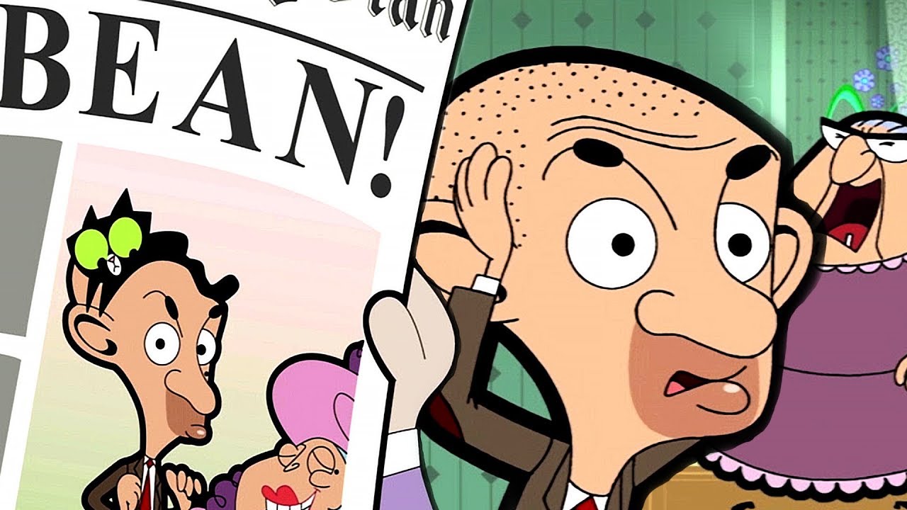
I didn't know how to begin my visual research on Gestalt until I recalled back to my childhood memories of cartoons I used to watch when I was in elementary school. This cartoon was no other than Mr Bean (Animated TV Series).
https://youtu.be/SwbQoekhRUM
In the episode, where Mr Bean had a new haircut for his photoshoot but it didn't work out well so he had to use a black cat to cover his bald head. I wanted to incorporate this idea into a Gestalt design using the fifth principle, Figure/Ground.
 |
Figure 1.2 https://i.ytimg.com/vi/SwbQoekhRUM/maxresdefault.jpg |
I came across this Gestalt design which gave me an idea on how to assimilate Mr Bean and the cat as his haircut. In this inspiration of mine, The penguin acts as the hair for the male figure while the face of the male is the penguin's body.
 |
Figure 1.3 https://www.pinterest.com/pin/78109374773127278/ |
IDEA EXPLORATION- GESTALT
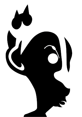
To begin, I sketched out some rough ideas for my Gestalt piece. I made a list of distinctive features that represent Mr Bean and the cat. Later on, I tried putting both objects together into a Gestalt black and white piece. After a few drafting, I couldn't quite see the cat's strong visual appearance so thought of connecting the cat's paws to Mr Bean's ears and the cat's tail to Mr Bean's nose.
I decided to test out my rough ideas so that I get a better view of my Gestalt design.
 |
| Figure 1.5 |
 |
| Figure 1.51 |
I included all the details that represent each object, the cat and Mr Bean. I used guidelines to trace out Mr Bean's head in Figure 1.5 and 1.51. I also did a second one, without guidelines, to help me see the Gestalt technique. In Figure 1.5, the design didn't look like Mr Bean instead it looked like a regular man. I decided to change the shape of the nose as Mr Bean's nose is a little crooked and pointed.
 |
| Figure 1.6 |
I decided to switch from white on black to black on white. The cat couldn't be seen above so I added a pair of its ears and eyes attached together to make the form of the cat. The eye and eyebrow on Mr Bean looked a little odd so I decided to remove the eye and include a few details on the eyebrow.
 |
| Figure 1.7 |
FEEDBACK
By: Ms Jinchi
"To retain Mr Bean's eye because visually she couldn't quite see Mr Bean's signature look. I re-edit Mr Bean's eye onto my piece."
 |
| Figure 1.8 |
I tried adding Mr Bean's signature mole to make my Gestalt piece more Mr Bean-like. Although Mr Bean's mole is on the right side near his nose, I wanted to make it visible so I placed it on the left side instead.
VISUAL RESEARCH- CONTRAST
I searched a few artworks to kickstart my research for my Contrast piece because I didn't know how to begin and I needed some inspiration.
 |
Figure 1.9 https://i.pinimg.com/originals/80/ba/f5/80baf54992f9b4d64ffbc8699909fb3b.gif |
 |
Figure 2.0 https://i.pinimg.com/564x/69/be/52/69be52bb03d32fe8e1cf00fcbc4388d6.jpg |
The first piece is a digital art sketch, it shows balance in terms of the two contrasting colors, black and white. Whilst the second piece shows the contrast between thick and thin lines as well as types of lines such as horizontal, vertical, or diagonal.
 |
| Figure 2.1 |
I was thinking about how to begin my piece while looking at what's in front of me. My study zone was always in front of a television. When doing my projects or assignments I often prefer to study in a noisy environment rather than a quiet environment because I can frequently obtain ideas and inspirations from the distractions around me or just by looking around.
IDEA EXPLORATION- CONTRAST
 |
| Figure 2.2 |
I started off with a sketch of a television in a front view perspective. To make this piece more interesting I decided to incorporate lines that contrast to one another, horizontal and vertical. This piece makes me feel as if I'm staring or facing directly in front of the television. The contrast of colors between the background and the focal object shapes out a pathway towards the television. The reason for using lines in my composition is because when you stare at the television for too long you get
 |
| Figure 2.3 |
The first piece looked quite simple and plain so I decided to upgrade it into this new piece that has more contrast between the lines and color. I incorporate the thick and bold lines on the television and pathway, making each side contrasting with one another. As for the thin lines, I incorporate them into the objects by tracing details onto them. The color of the line contrasts with one another while the background also contrasts with one another due to the color. This piece looks interesting to me as it reflects my 2nd inspiration in my visual research. The feel of this piece is also quite comical and to my aesthetic.
 |
| Figure 2.31 |
Similar to the upgraded piece, I wanted to play around with the placement of my lines and the color. There is contrast and balance between the lines on the pathway and also in the background. The pathway color is white while the background color is black showing contrast in color. There is an invisible symmetrical line that separates the lines in the pathway and in the background.
After making these two upgraded pieces, Figure 2.3 and Figure 2.31, I wanted to ask Ms Jinchi for her preference in which design she preferred. During our feedback session, Ms Jinchi asked me back which design did I prefer, as a designer. Personally, I prefer Figure 2.3 as the composition is well-balanced in terms of the contrast as well and the space around is visible and used properly.
FEEDBACK
By: Ms Jinchi
"Figure 2.31 looked complex compared to Figure 2.3 and Figure 2.2. Both Figure 2.3 and 3.2 represent Contrast so I was free to choose either one of them."
In the end, I choose Figure 2.3 as my finalized Contrast composition.
SUBMISSION:
Gestalt
Contrast
REFLECTION:
This theory was pretty easy to comprehend but utilizing the technique for Gestalt was quite tricky for me. From a glimpse, Gestalt looked easy to design due to the way it's structured. However, when I first did my Gestalt piece it was challenging to place the elements to be visible in one's eye. On the other hand, Contrast was a piece of cake because I understood the theory and concept of using the techniques. Overall I think this exercise was a good start-up for Design Principles as it educates us on basic principles of design and also trains our ability to see the unseen.
SOFTWARES:
- Adobe Illustrator
REFERENCES:
Cherry, K. (2020). What Is Gestalt Psychology?. Retrieved 24 August 2021, from https://www.verywellmind.com/what-is-gestalt-psychology-2795808
Cherry, K. (2020). What Is Holism?. Retrieved 24 August 2021, from https://www.verywellmind.com/what-is-holism-4685432


Comments
Post a Comment